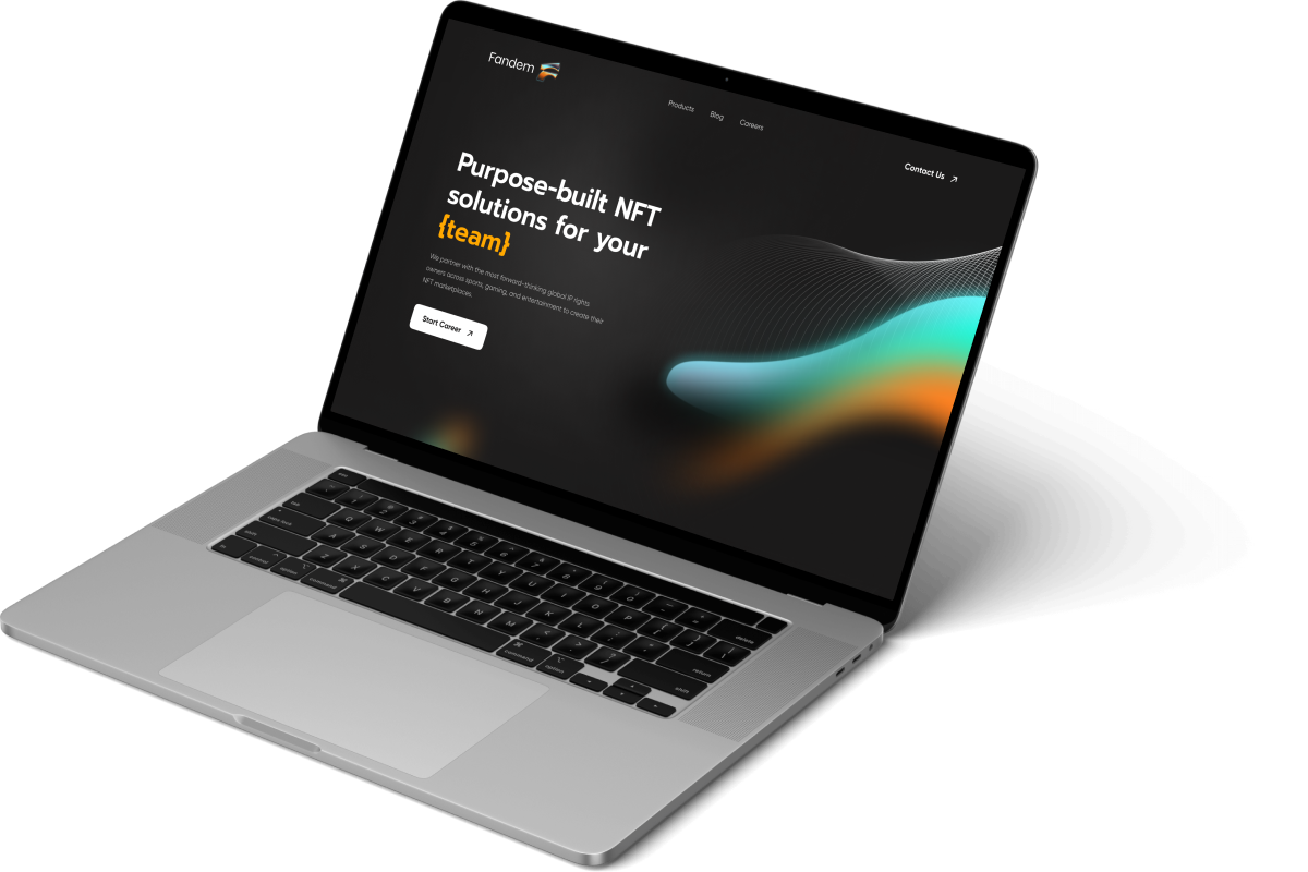
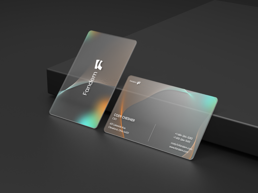
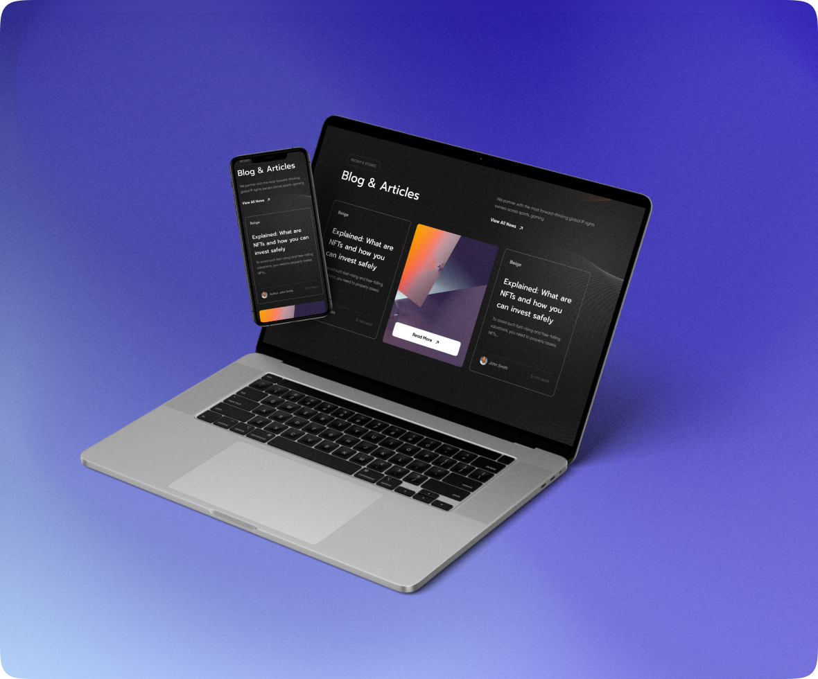
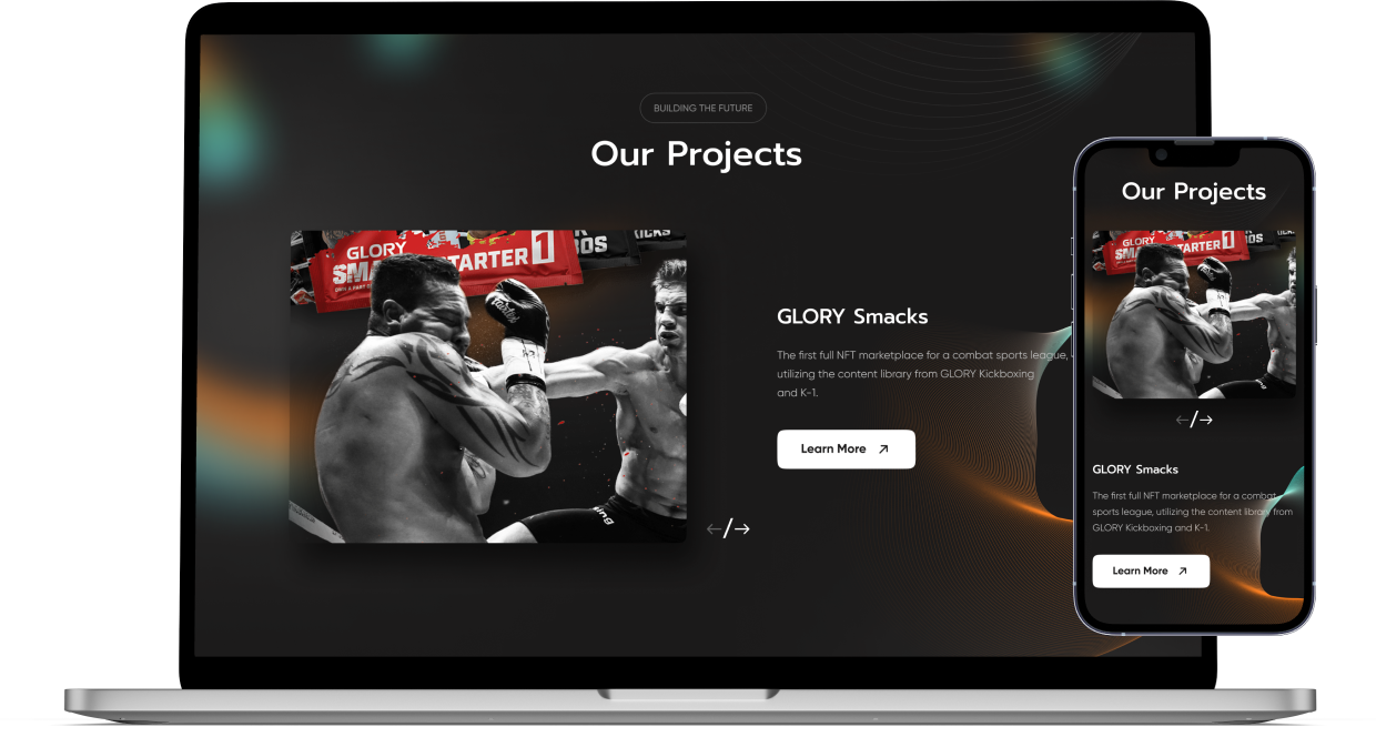
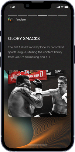
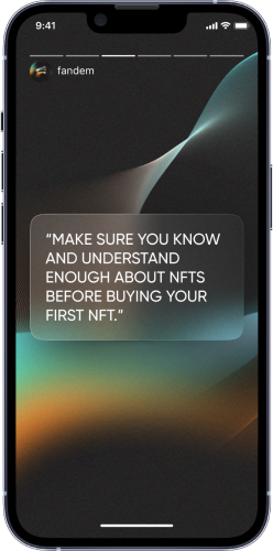
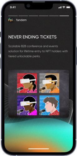
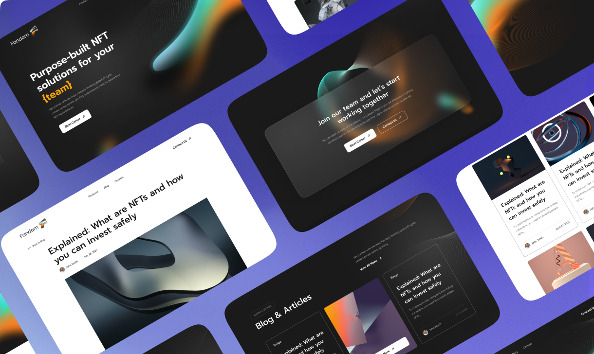
Website and Branding
Fandem
Desktop
Mobile
A company that designs and builds NFT marketplaces for sports organizations, entertainment properties, and brands.
Challenge

Current live app was pretty out of date from the design point of view. The client wanted to make updates in the UX part and overall user flow, with some features added and changed to make the app easier to use. The app also required UI refresh as the client wanted to make it look more modern.

Identity

The idea of the sign is to stylize the visual meanings of the brand’s work field and name them into simple geometric shapes. A stylized letter “F” has special roundings that give the letter a unique and flowing look, giving the impression that it is going up.

Decision

Suggested fonts, colors and overall design direction to be followed. Completed the UX part from scratch, showing the clickable prototype to the client to follow the user journey. Made a style research and suggested making the design in dark colors to correspond the SaaS, mechanic, engineering color range. Worked over the internal admin panel with different accessibility types – available for regular users and for Datum employers.

Result

Updated the app structure, as well as a new design. After that, worked over the onboarding screenshots in the AppStore. Before the release of the app in live, prepared banners for the actual presentation of the app in London

Have a project? Drop us a line.

    I’m interested in...
    Name
    Email
    Tell us about your project..